Graph viewer
Launch
Open a terminal or command prompt (
PowerShellon Windows) in the folder where you extracted the project files. Example forC:\palm-tracer. Open the terminal and type the following command:cd C:\palm_tracer, then press Enter.Make sure the virtual environment is activated if you use it.
Launch Napari with the command:
napari
Note
If you did not create a virtual environment, Napari can be launched from anywhere.
Enable the plugin in Napari:
Note
It is also possible to launch Napari directly with the plugin using the command: napari -w palm-tracer
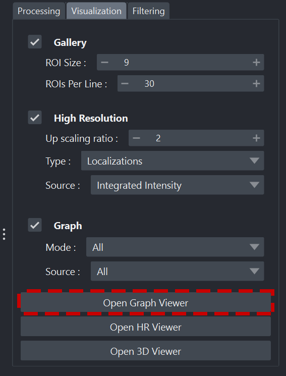
In the Visualization tab of PALM Tracer, there is a button to launch the graph viewer: Open graph Viewer
Launching the viewer
Interface organization
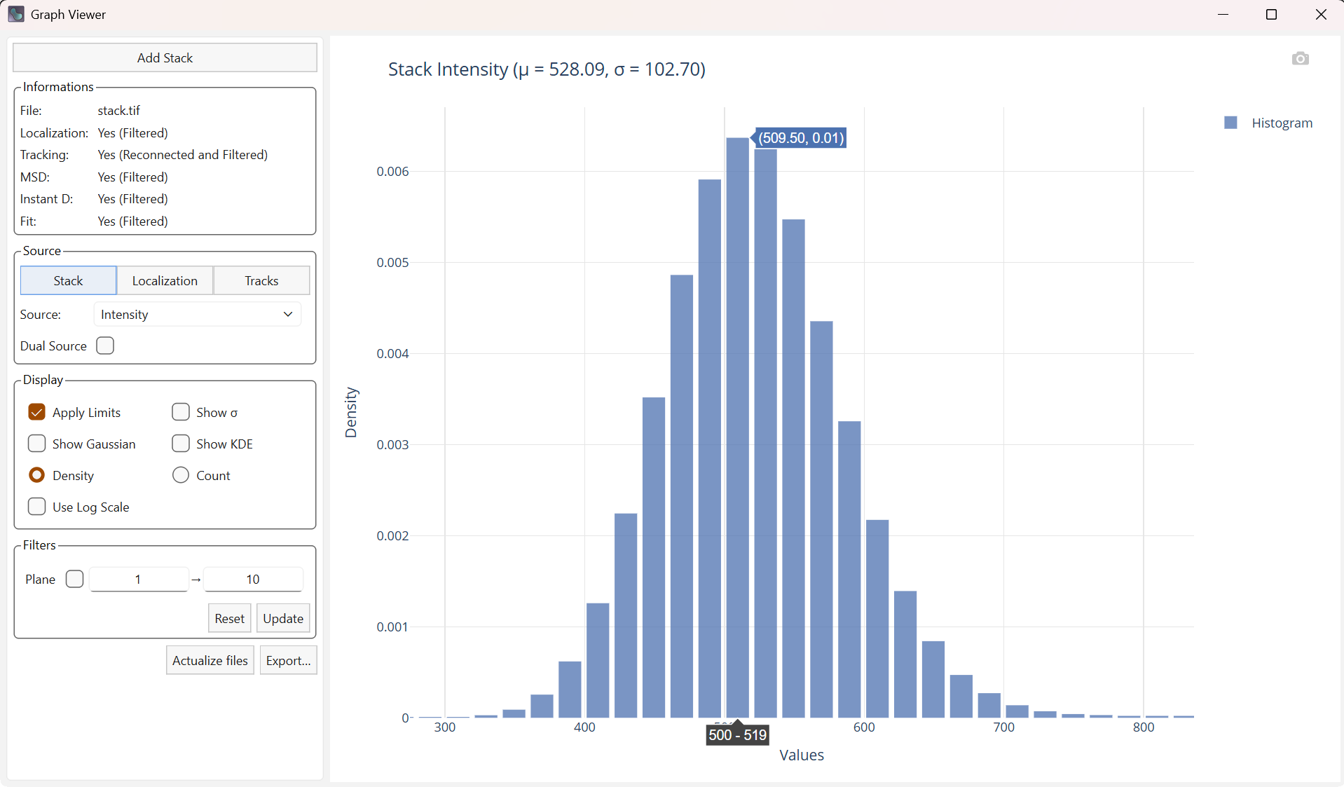
Overview of the graph viewer
The graph viewer interface is organized into two main panels:
On the left: the options panel used to configure the plots
On the right: the generated plot
Settings panel
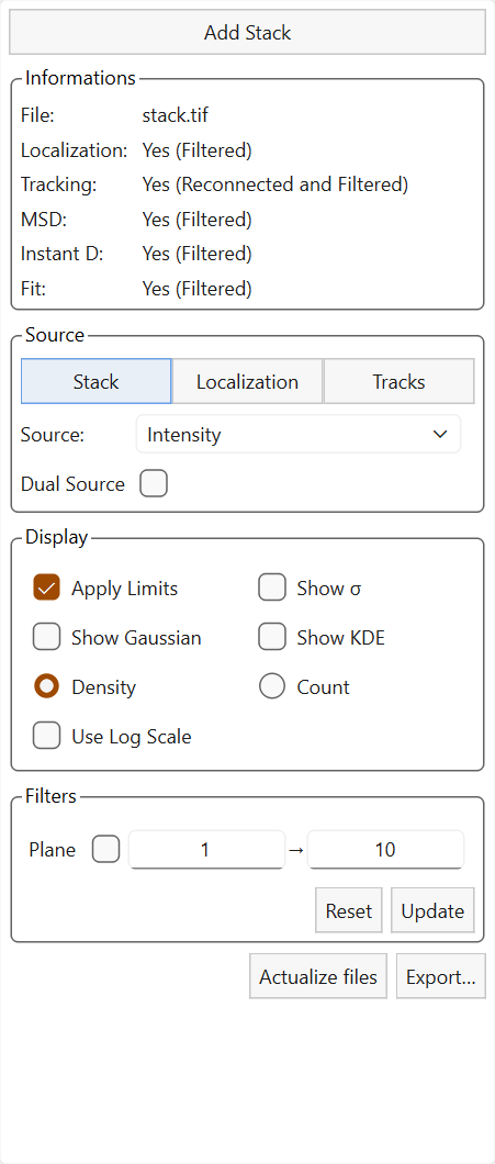
Settings panel.
The left panel contains the main settings used to control the plots.
The widget is structured as follows:
Information tab
Source tab
Display tab
Filters tab
Buttons Actualize Files and Export….
Visualization panel
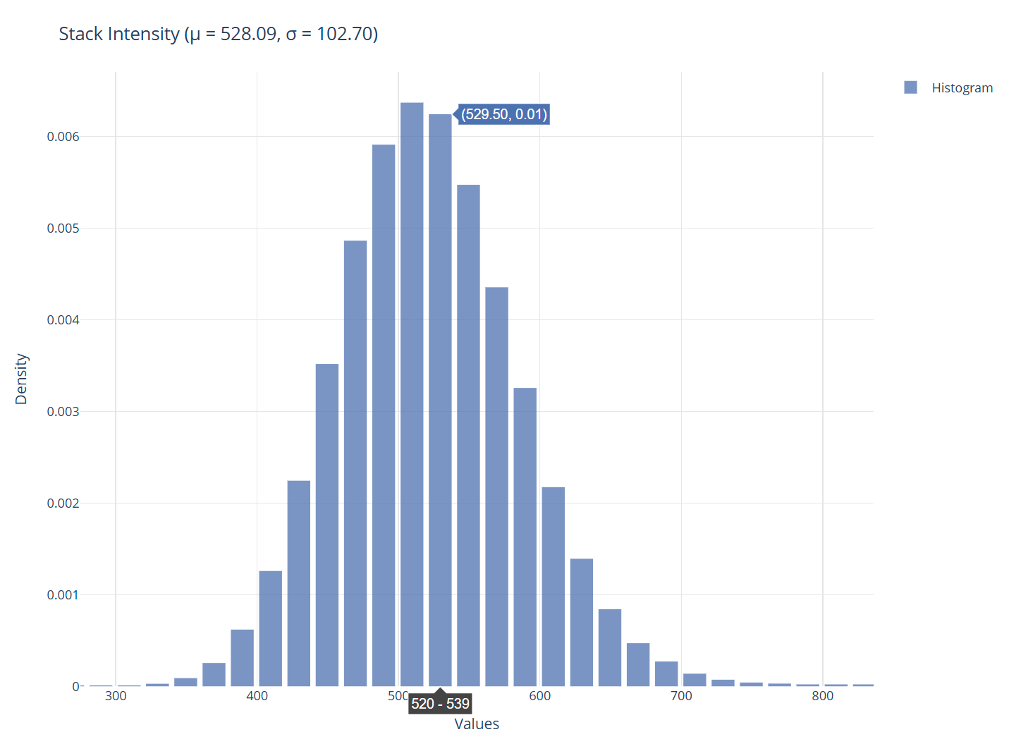
Visualization panel.
The right panel displays the generated plots. You can hover the plot to see the values associated with the plot.
Add a stack
The viewer is initially designed to be launched and used from the main PALMTracer interface on Napari. It is possible to add a tif file from the viewer. It will be automatically added to the batch in the main interface and the latest computes for this new file will be loaded.
Note
The viewer can also be launched independently of the main interface; adding a stack and load results can only be done using this button.
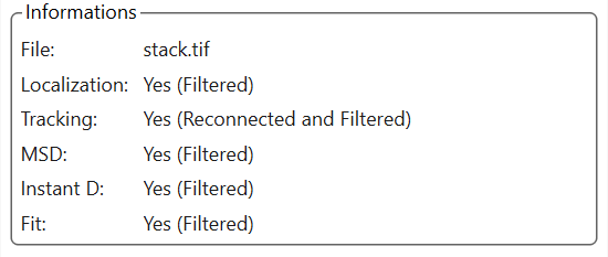
Information tab
Information tab
This tab contains the name of the current file, as well as a status for the different data categories (Localization, Trajectories, MSD, Instantaneous diffusion, Fit).
The status is defined as follows:
No: No data.
Yes: A standard table.
Yes (Filtered): A filtered table.
Yes (Reconnected): A trajectory table that has undergone reconnections due to blinking.
Yes (Reconnected and Filtered): A trajectory table that has undergone reconnections due to blinking and has been filtered.
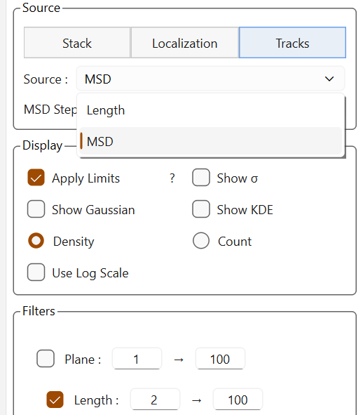
Source tab
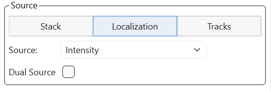
Source tab
There are three types of data to visualize: information related to the loaded stack, localizations, and trajectories.
Note
The source dropdown list adapts dynamically depending on the available sources, especially for trajectories where the available data vary depending on the fitting.
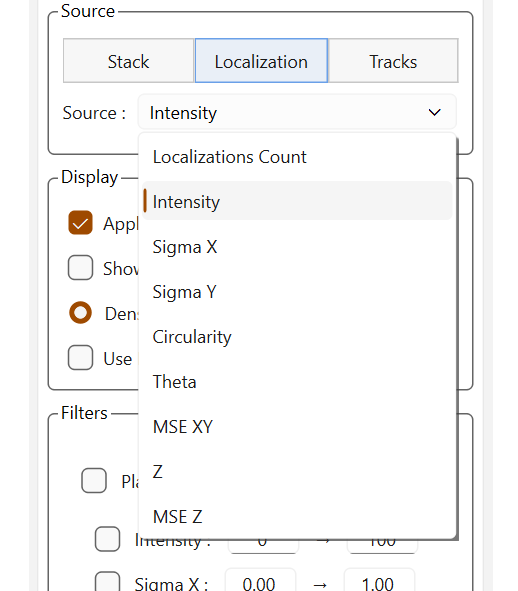
Sources for localizations |
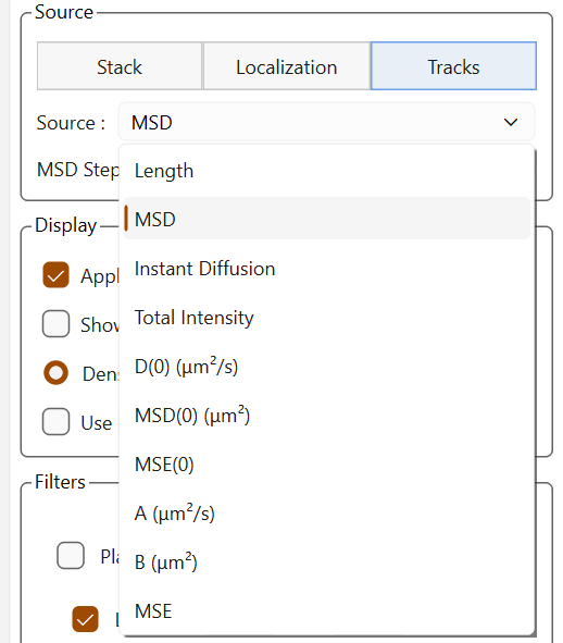
Sources for trajectories |
Sources for trajectories without fittings |
Display tab
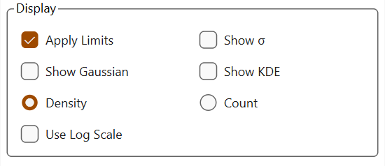
Display tab
This tab allows you to define a few display options without modifying the data:
Apply limits limits the display range on the X axis using the 3-sigma rule (only elements within plus or minus 3 sigmas of the mean are displayed).

Simple display |
Display with limits |
Show Sigma adds bars to the plot for the mean (solid line), and the mean plus or minus 1, 2, and 3 sigmas (dashed).
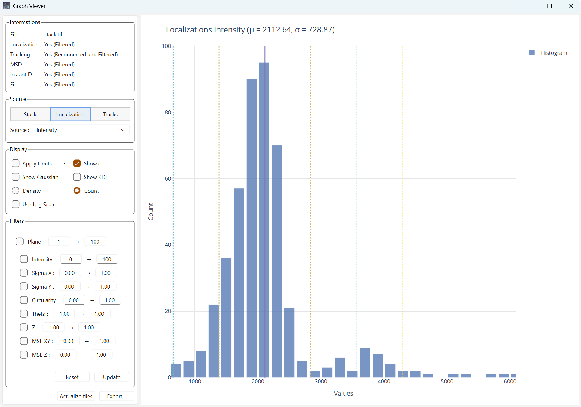
Display with mean and standard deviation
Show Gaussian adds the Gaussian associated with the mean and the standard deviation computed from the data.
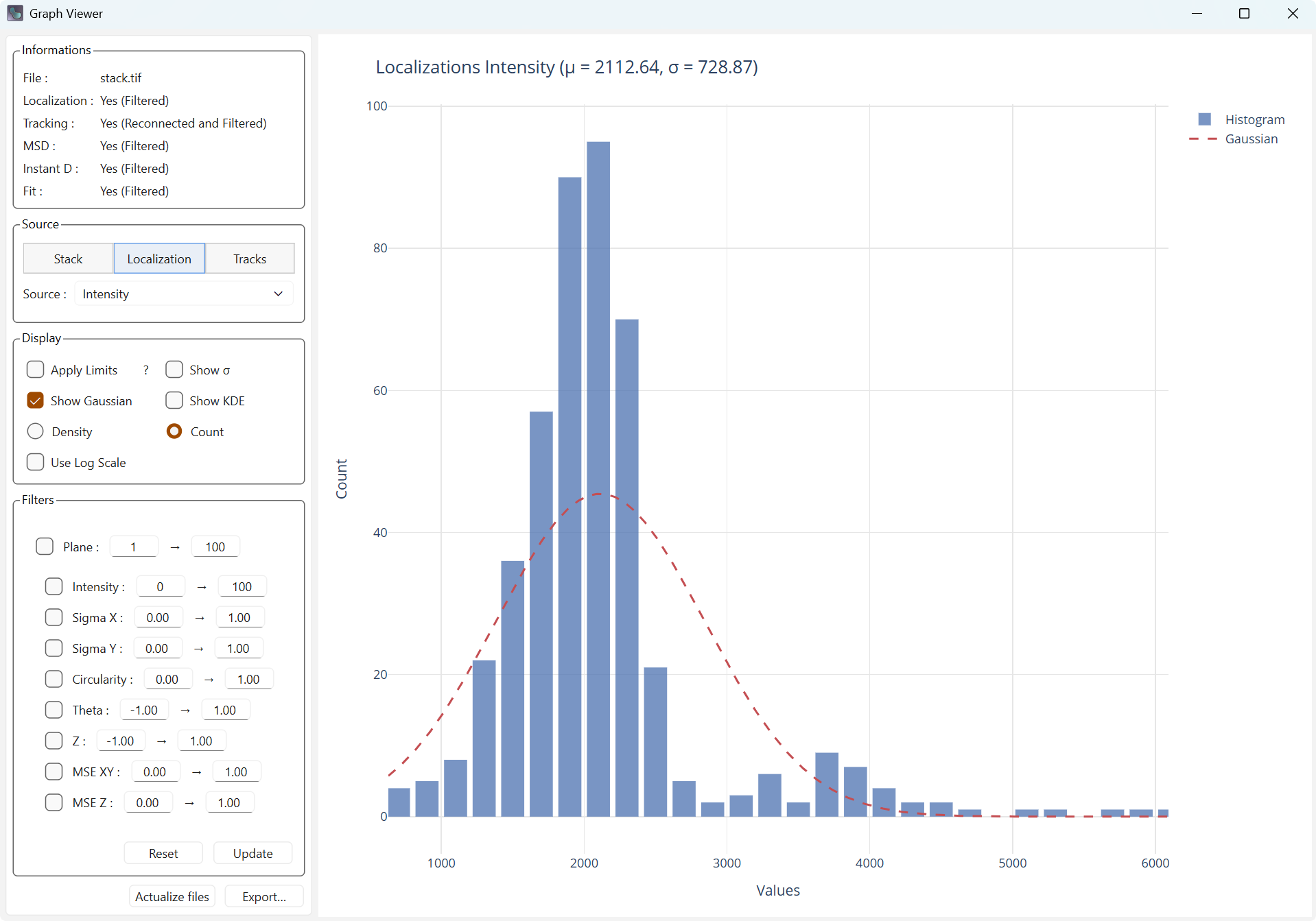
Display with Gaussian
Show KDE adds the data kernel density estimate (KDE), which is the estimation of the density at every point.
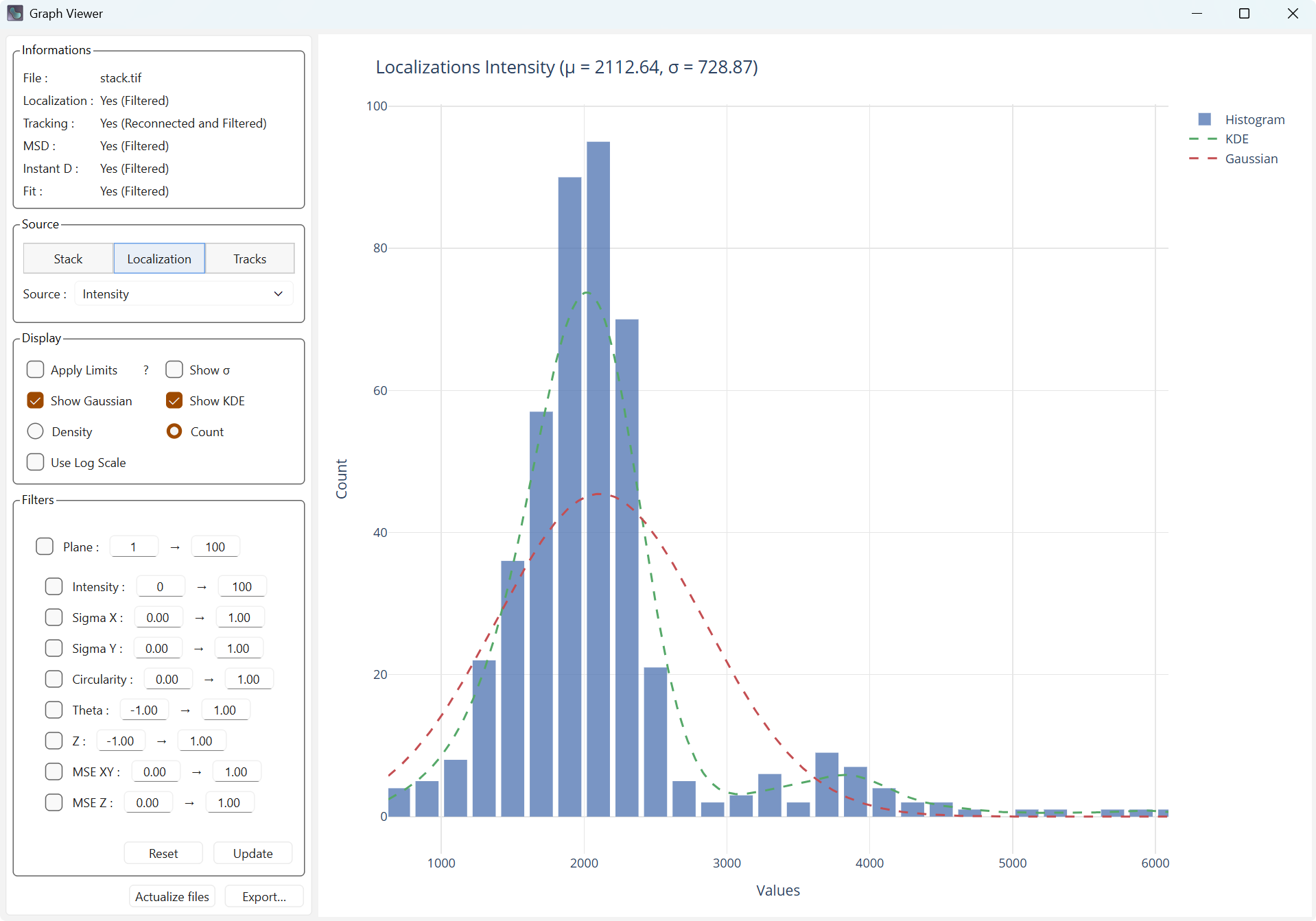
Display with kernel density
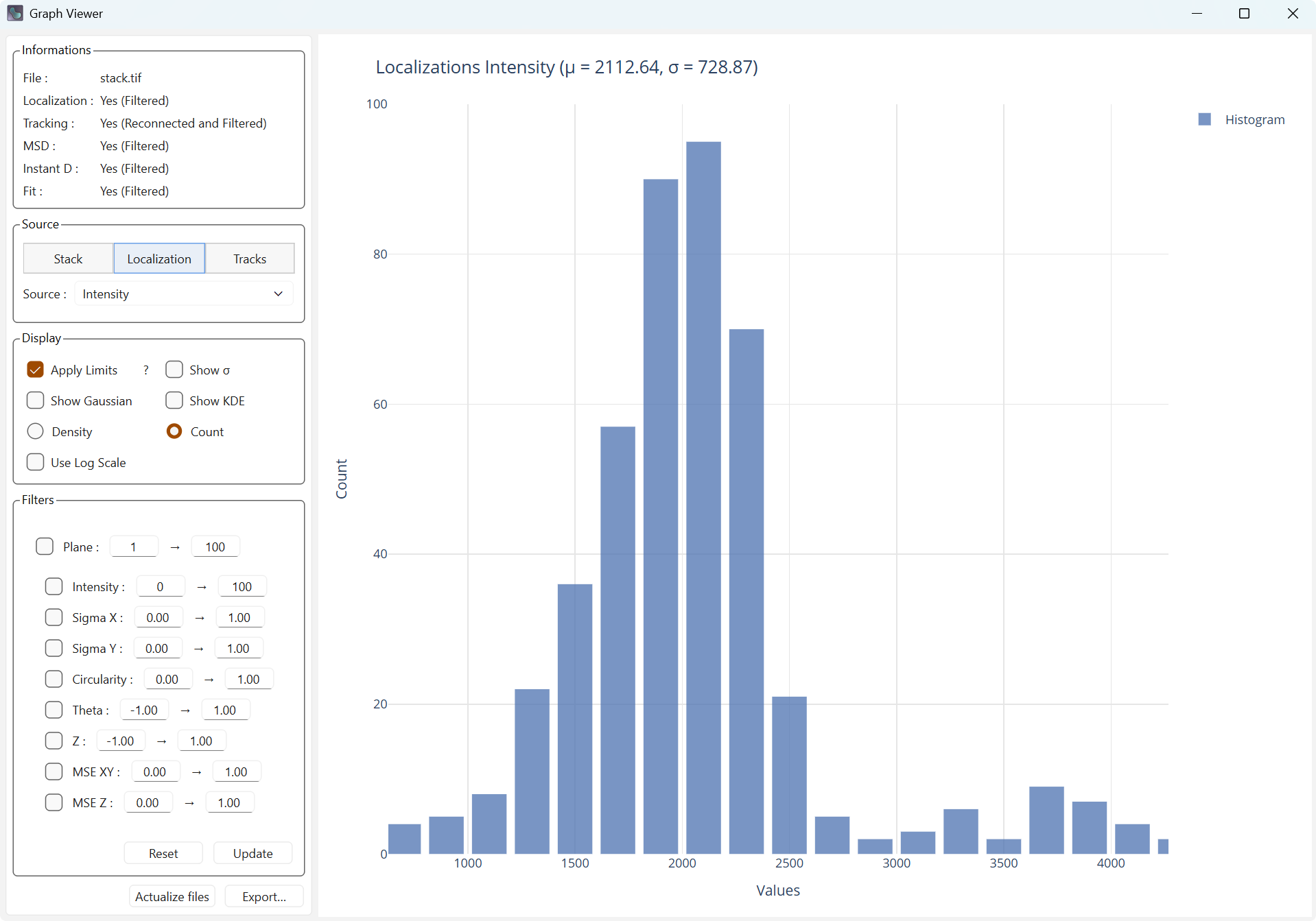
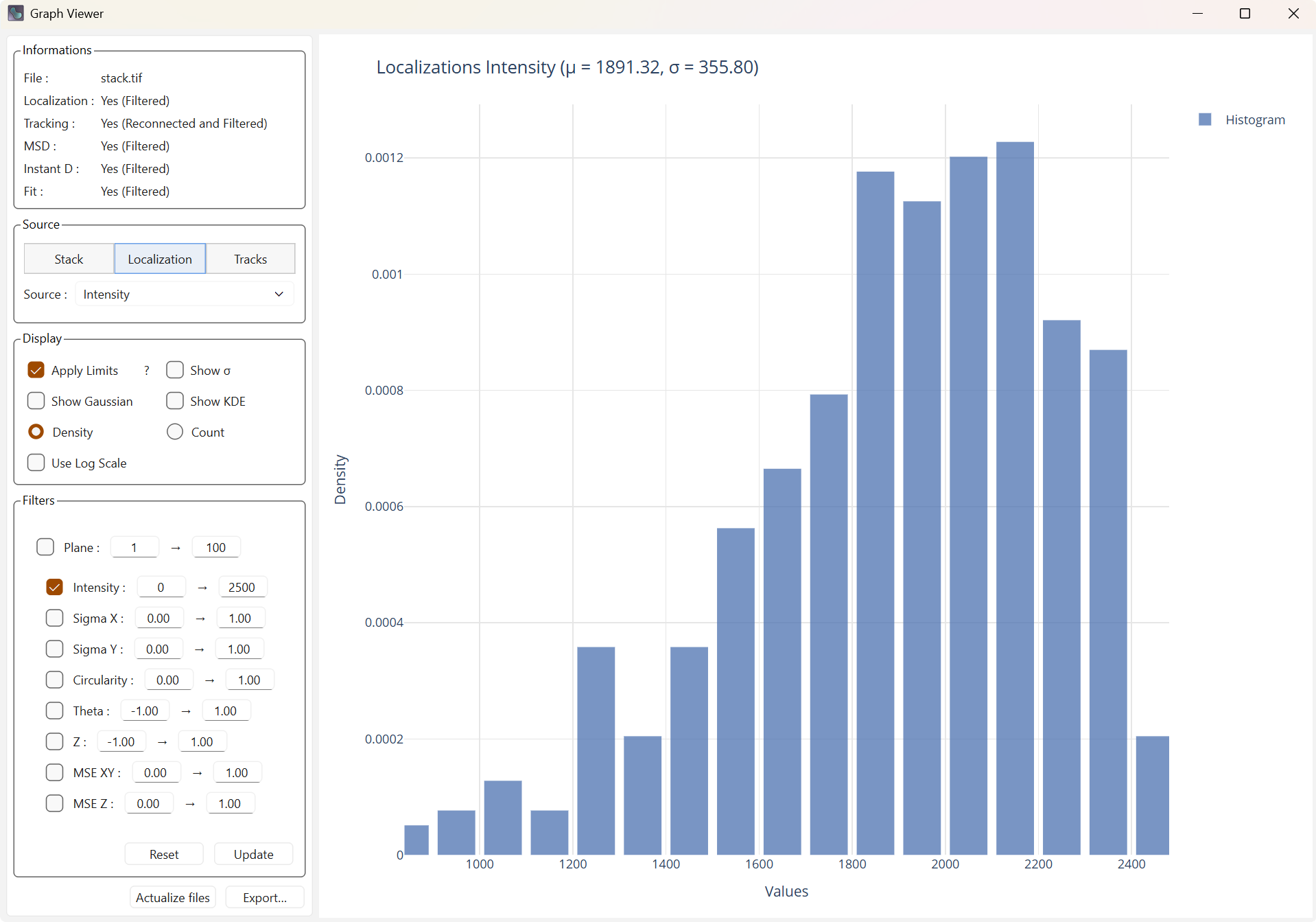
Density and Count allow defining the value on the Y axis.
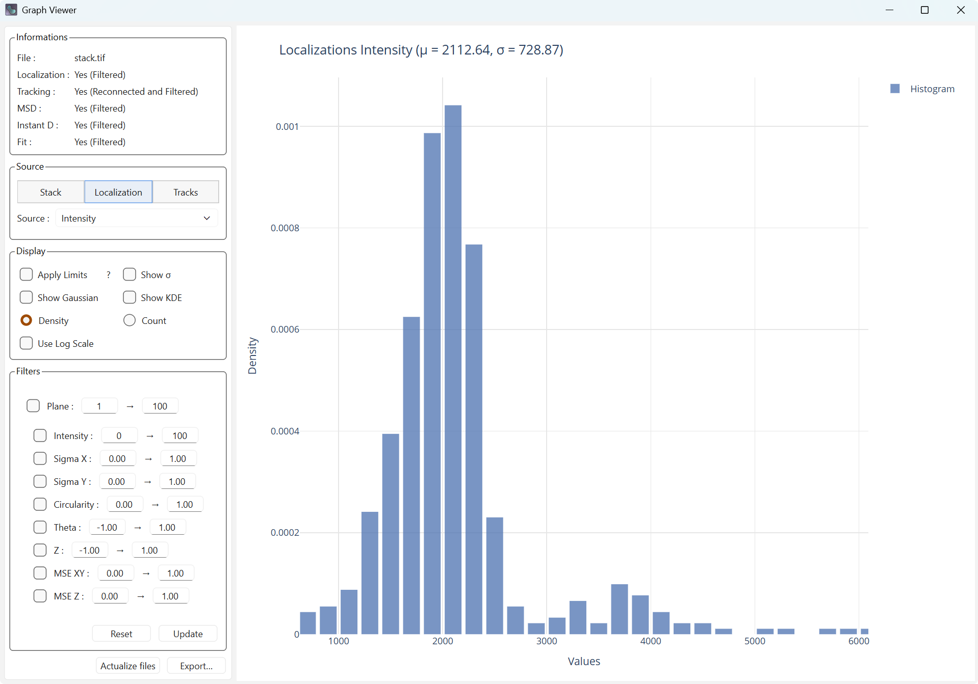
Density display |
Count display |
Use Log Scale changes the scale of the X axis to a logarithmic scale, which can make the distribution closer to a normal distribution.
|
Standard scale |
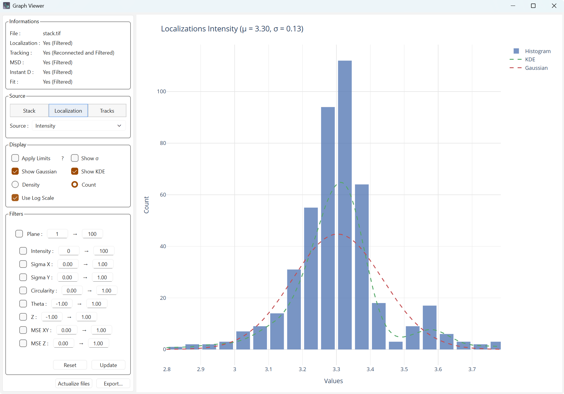
Logarithmic scale |
Dual Source
Dual Source allows you to create a graph with two different sources. The curves associated with the distributions (Gaussian or kernel density) will then be displayed as a heatmap. The kernel density (KDE) is an estimate of the density based on the two sources, which may be more visually explicit.
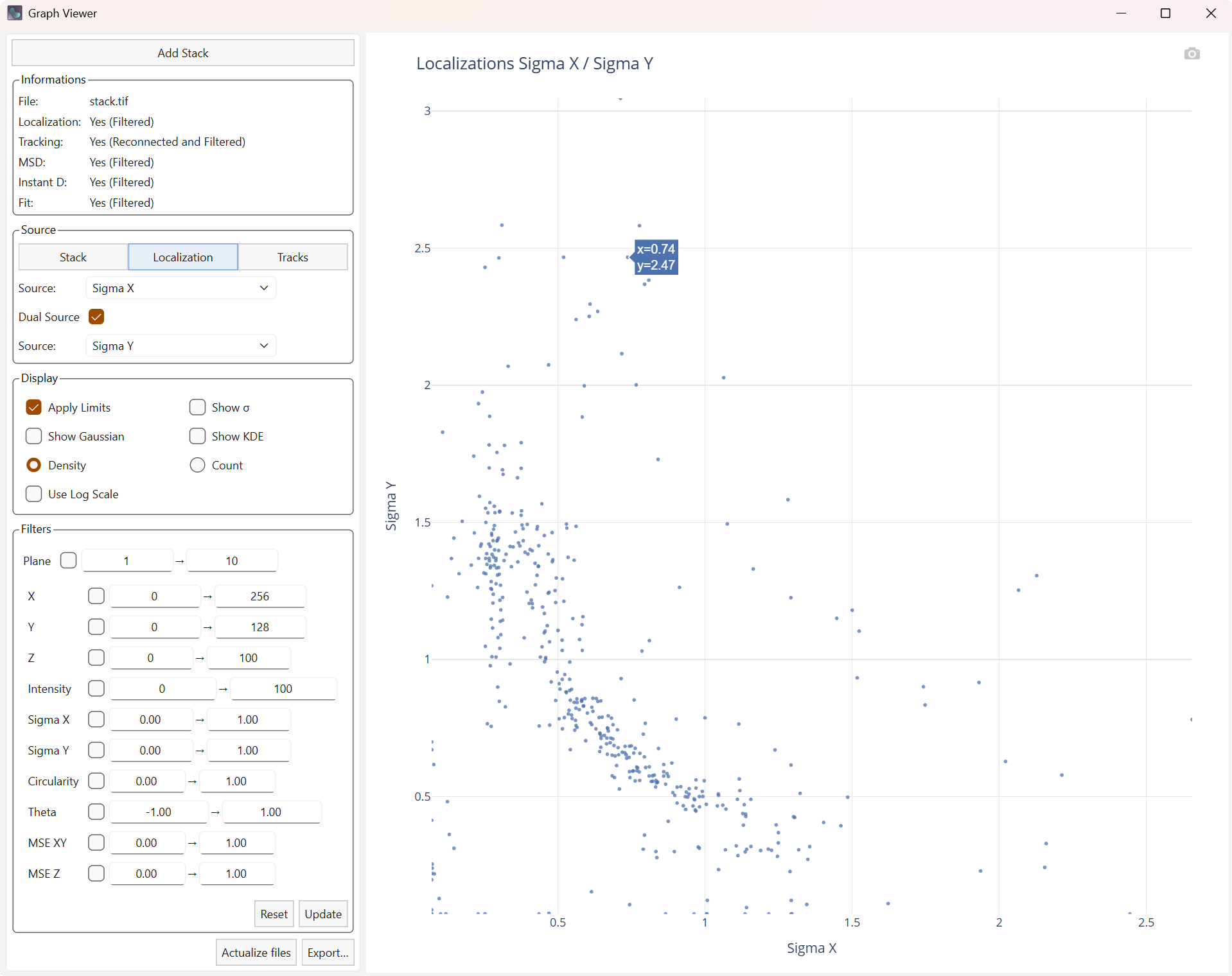
Display of the Sigma in X and Y. |
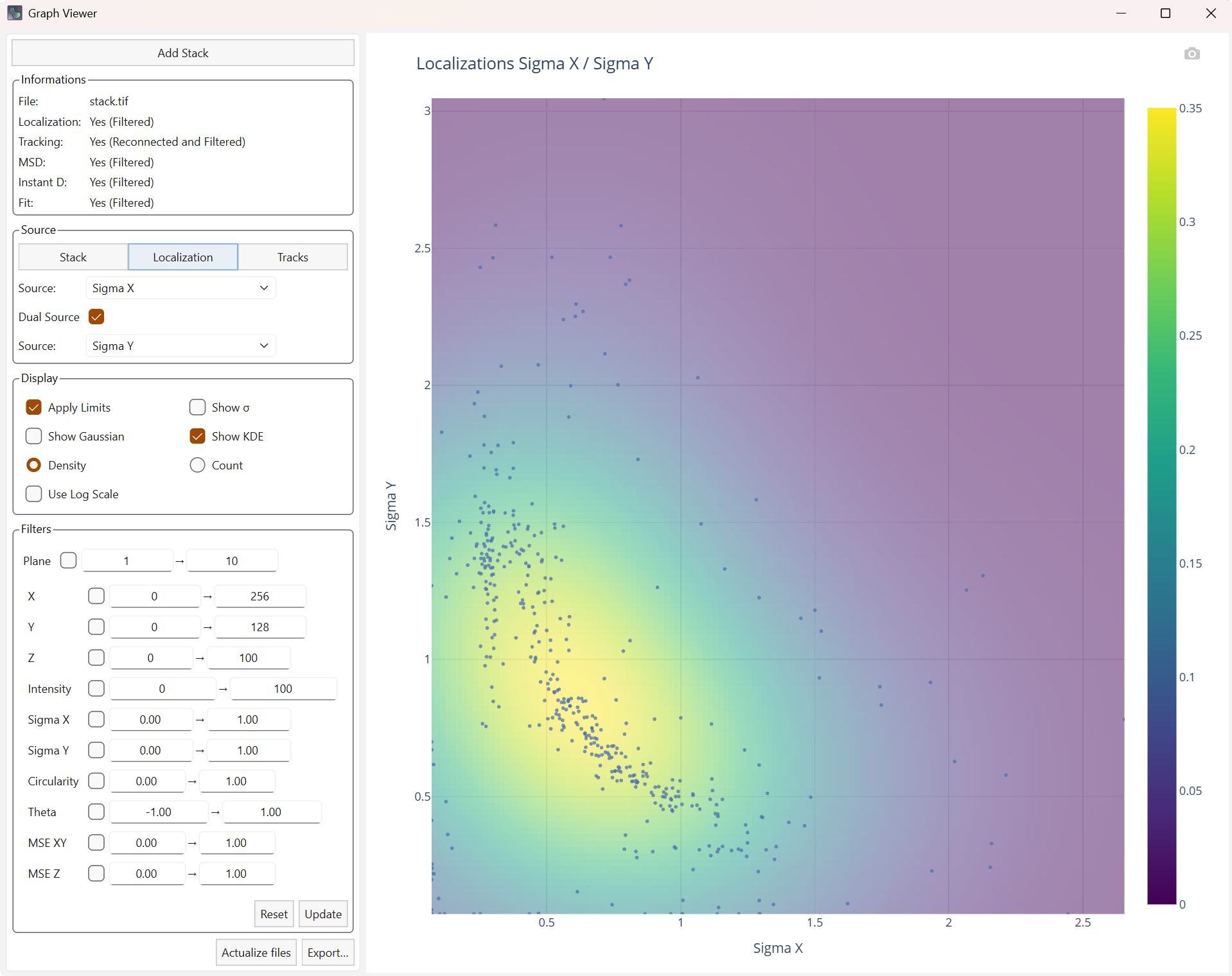
Display Heatmap of kernel density |
Filters tab
Depending on the data type, the list of filters is updated to keep only those related to the data currently being displayed.
Filters for the stack |

Filters for localizations |

Filters for trajectories |
Each filter must be checked to be active, but it will not be applied until you press the Update button. At that moment, the filters will be applied within the main interface to the latest data in memory (base data or already filtered data), and the filtering options will also be updated in the main interface.
Pressing the Reset button will remove the filtered data from memory, and the information panel will show this update in the file statuses. The filters will not be cleared, so you keep all your settings and can make the small adjustments needed before running filtering again. The current plot will be recalculated after the reset.
Display with filters |

Display with reset filters |
Note
If you removed localizations using filters, the trajectories are not recalculated. Some trajectories may then contain filtered points, and a new processing run with the active filters must be started in the main interface.
Link with the main interface
This viewer is strongly linked to the main PALMTracer interface and cannot work on its own. It uses elements computed in the main interface dynamically.
The following elements are used:
Localizations (filtered or not)
Trajectories (reconnected if they were, and filtered or not)
Trajectory calculations: MSD, instantaneous diffusion, fittings (filtered or not)
Several elements allow bidirectional communication between the two interfaces:
Actualize files, located at the very bottom, allows you to update the different tables if a new computation has been performed in the main interface.
Reset allows removing the filtered tables to start again from a clean base.
Update allows applying your new selection of filters to the tables (filtered tables if they exist, otherwise the initial tables).
Export
When you press Export…, you will have a choice between several file formats to save the plot you currently have:
HTML saves an interactive web page (including PlotlyJS), like in the viewer.
PNG exports an image of the plot rendering.
PDF exports the image into a PDF file.
You can also click the camera icon (📷) above the plot to save a PNG image directly.